Welcome to my blog.
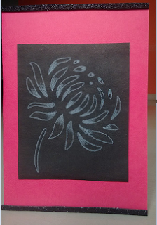
It's a CAS card today. This was made very quickly but I did spend some time thinking over how to use the flower in the card!
I have a chrysanthemum stencil which I used to outline on a black paper, then using water color pencil did some shading. After that I was totally confused, how to use this panel. Finally I mounted this on a bright pink card stock and added glitter foam strip at the top and bottom layer.
I liked how it turned out but still felt something is missing, finally giving up on the thought of adding any other element.
Entering into following challenges.
Less Is More: Color Challenge #270
Simon Says Stamp Wednesday Challenge: Anything Goes


Very eye catching! I like how you used a stencil to create the image - a creative way of achieving that focal point. Black and pink are a great combination :)
ReplyDeleteThank you Esther
DeleteI love the shading on your bloom, which is so eye-catching.
ReplyDeleteThanks so much
Chrissie
"Less is more"
Thank you Chrissie
DeleteFabulous card ...... loving your floral image !! I have also become your latest blog follower.
ReplyDeleteI am glad you liked the card. Thanks for being my follower and in this process I discovered your lovely blog too :)
DeleteNice dramatic card. Thanks for sharing at Less is More!
ReplyDeleteThanks Susan
DeleteSuper striking and really dramatic with your hot-pink border. Love your coloured highlights and a great take on our non-white white space challenge. Thanks for sharing at Less is More this week. Sarah
ReplyDeleteThank you for the lovely comment
DeleteIt may be simple but it looks really lovely. Debra x
ReplyDeleteThank you Debra
DeleteVery pretty! Thanks so much for playing along with the Simon Says Stamp Wednesday Challenge!
ReplyDeleteThis is just beautiful, simple to you but very creative to me.xxx
ReplyDeleteThe chalkboard effect on this is really lovely. It's something I've yet to master, so thanks for the inspiration! By the way - you should add your blog web address to the "about" section of your Google+ so people can find you more easily! :)
ReplyDeleteFabulous shading on your black backdrop, love the addition of the hot pink.
ReplyDeleteThanks for sharing with us.
Anita x
Less is More
Super make, I like it as it is but, if you still think something is missing then PERHAPS a small sentiment
ReplyDeleteKathyk
Gorgeous card, the pink frame makes the card look really striking. Love the image too.
ReplyDeleteLiz - LIM Guest Designer xx
Such a clever way to use this stencil, and the black background is such a great choice!
ReplyDeleteBlack is a color to make anything look good, I am a big fan of black, and your stencil use has come along so well.
ReplyDelete